Friday, 4 March 2011

100 boots

 
The book 100 BOOTS and accompanying exhibition is a collection of 51 photographs by photographer Eleanor Antin. She photographed 100 black wellington boots across the United states. Each image in a different location. the boots normally in pairs suggest marching or a single line of people walking, it gives almost this impression of someone being there, but not quite. The locations range from normal street views, to inside an art gallery. The fact that even just by placing the boots there suggests more then just a pair of boots putt there, but can suggest that it is doing something, for example looking at something, or waiting for somthing. All the images are black and white, and in the book is just accompanied by the text '100 boots...' and then stating what theboots are doing, making them appear far more animated then a simple inanimate object. After looking this during our book project in year one, when thinking of the idea of the shoes on the table superstition it did automatically make me think back and get drawn back to these images. They are just cute and rather entertaining images following around the story of these 'wandering boots.' It makes me think, what kind of story do i want to create with my images?


Shoes on table- bad luck

According to susperstitions its bad luck to put new shoes on a table. This auto matically reminded me of a book a looked at in the first year called '100 boots' (see write up) and how they use shoes to create a narrtive and almost create the boots to no longer be inanimate. I wanted to look at this and experiement slightly with this. I wanted the shoes to be reflective of the surrounding. The first experiment that i wanted to try was just simply in my room, a students room, so i used trainers (which ironically were new!) and tried to get the look that the shoes are actually doing something at the table. My plan is to have an image of the shoes in the location and creating a dyptic with a close up of the shoes, I got the following images:
However after shooting here i felt rather uninspired, i was very unhappy with the images. They didnt have the high standard feel of the other micro projects that i have taken leeps and bounds. What was the next step? i thought id experiment with the idea of new locations as maybe it was just the location i was not happy with.

Veronica Bailey- Modern Myths

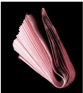
I found this collection when looking through catalogs in the libuary. Veronica Bailey is a photographer and artist. Her work focuses alot around the idea of multiples, collections and the idea of time passing. The work that first got me looking into to her work was the collection entited 'Modern Myths' to which she takes different newspapers and photographs the edges, and references them to greek mythology. This idea that the image is changed from that of a peice of paper to something far more conceptual and deep with the addition of text is very important. The use of text and its influences over the audience is important with this book.

The images themselves are very similistic. the pages of the news paper distorted and twisted to create shapes. The idea that newspapers are used, publications with mearly 24hour shelf life, to create representations of what was popular storys and tales is very well thought out.


top to bottom:
Apollo,
Zeus
Hera

Thursday, 3 March 2011

Alternative mirror trial.

One of the peices of feedback i got from tutorials would be to try editing the 'out of focus' images to have a  crack across it to fit in with the idea that its the image on the mirror.
Using exsisting cracked mirror photos i got the following results:


While it does add to the fractured look of the images, i am still unsure about these images in compaired to the undeditied images. Thinkin practically the images will be blown up to fit in the 12 x 12 book, would the editing look of the images just look to... fake? I have tried to steer clear of big photoshop jobbys like this as i dont want to quality of the book to fall due to one photo not having the right standard for such a big book.  I think it works better on the second image, as the cracks were more in focus as the crack images i played alot with the idea of depth of feild. I think this will be decided when it comes to laying out my structure for my book.

Wednesday, 2 March 2011

More mirror experimentations

As i thought i should delve into experiementing abit more with the idea of the cracked mirrors to see what other styles and representations i could include.
I really like the imagery of the broken mirror and because the two mirrors ive already have used have been to similar, both heart shaped. I thought experimenting with a new shape or type of mirror would be a good avenue to go down. Some of these images did turn out how i wanted them. However i would need a pairing for these images so i returned to my reserch around the themes and words people accosiate with vanity, which lead me to take the following images.
Which created the selection for dyptics:


The top dyptic were created with just a simple square crop to the images and a slight adjustment of brightness and contrast. 

the second dyptic was created in a similar way, however like the eye dyptic from before, the mirror image has slightly had a colour adjustment to carry on with this idea of the colour linking the two images. Out of the two i like this better for the repetition in the shaping and colours in the images.


The only problem with these that i have is that they dont really fit in with the other two unless i found something seperate to fix it with, and would look like its just been thrown in. i do really like the use of the broken mirror here, so maybe depending on the layout of the book i could still try and work that into my work.

Tuesday, 1 March 2011

Rinko Kawauchi

My work, has apparent connections to the creative style of Rinko Kawauchi. Her work is very focused on colour and style. the feel of the images are just as important as the context and meaning. Each of her photographs are very cold in tonings, very clinical. Theres alot of blues and white hues. With the square crop and playing with the depth of feild its clear the connection between some of my susperstition images.  The most obvious is the connection to the breaking mirror images.   The simplisity, the colourisational choices, the depth of feilds.  Her image screams similicity and an air of natural beauty. Even the simplist of things, everyday things have been turned beautiful in these square cropped images.


Richard Prince

Richard prince, what attracted me to his work is his use of text in his paintings and works. Best known for his more out there peices of artwork such as reanacting adverts and such. However his use of comical texts in paintings is what made me look at him.  *best viewed large*


Text is going to be a very big thing with this book so i do really need to look into how people use text and images together as one.