I will be handing in:
My notebook
My final peice ( a 12x12 large square book)
and a project guide with Cv and Artist statement.
A peice of paper stating my blog address.

Wednesday, 4 May 2011
Project Evaluation
With this project, i feel like ive gone on a very long joyrney and finally have reached an equilibrem which i am happy with. After a slow start, finally descovering something i could get my teeth into was a big boost. Most of my micro projects have come along way from the start. With one thing being the initial idea and then developing into images that i am proud to call my own. I have struggled with finding artists, as many photographers dont over this idea of susperstitions However i have made key connections with other aspects of my work. My main inspiration comes from the work of Sophie Calle and her work with text and imagery in the book exquist pain. The stylistic approach of rinko Kawachi is very similar to some of the techniques and styles i have used in my own work and the work on susperstitions by Ansley west. I have also taken a great deal by looking at a range of artists that use text, repetition and the different structures and layout of books, which have informed my final peice. If im honest, i would of loved more time to delve deeper into the many supsertitions out there, as well as finally make work some of the supsertitions i had problems organsising or completeing to a standard i found suitable. I honestly want to continue along this project as i have found it both fun and exciting. I do like how it has allowed me to explore many different techniques, different styles and overall build up my portphilo with a range of work that is both different and coherient. My next step is to create the smaller version of this book for everyday resale and approach different locations on stocking my book and/or showing some of the more specific supsersittions in a gallery space. I think from my original images not only have my themes and concepts evolved but my technique and personal style. If im honest at the start of the year i felt like i had lost my passion and got stuck in a rut but my idea evolving into such a great project has helped my own self confidence as a practitioner.
Presentation and audience.
Over the last few weeks my focus has been moved towards this idea of audience and how my audience would percieve my work. Being a book its not very easy to exhibit. While my original theme was based to the 'be inspired' competition, its not very forward thinking for my project that has now lent itself more to a book format. While i could still exhibit sections of my collection, maybe presenting work from just one superstition i dont think it would work to be showing all at once.
If i did show in the gallery it would be a choice of three of the bigger superstitions and i would want the images to be printed big. A1 or A0 size. Then the full collection in the book can be shown in the gift shop in the book. (editied into an image of the nottingham contempory)

The book will be avalible from blurb already. As well as a link to the blurb site on my website. The book itself is rather expencive at £50 printing cost so with the addition of profit would be around £60-65. However there is an option for me to create a smaller squared book, or a softback which with profit would work out about £20 a pop, which is much more affordable.
I could see my book as a coffee table book among the houses or artgallerys around the country, or even in art based coffee shop like
'THE DEAF CAT' a small independent art based coffee shop in my home town. I have approached them about entering my book to them for free, with the addition of my cards to accompany them.

The great thing about the smart phone barcode means if someone does see it in a shop or coffee house that they can scan it and automatically be directed to the page where to buy it themselves.
If i did show in the gallery it would be a choice of three of the bigger superstitions and i would want the images to be printed big. A1 or A0 size. Then the full collection in the book can be shown in the gift shop in the book. (editied into an image of the nottingham contempory)
The book will be avalible from blurb already. As well as a link to the blurb site on my website. The book itself is rather expencive at £50 printing cost so with the addition of profit would be around £60-65. However there is an option for me to create a smaller squared book, or a softback which with profit would work out about £20 a pop, which is much more affordable.
I could see my book as a coffee table book among the houses or artgallerys around the country, or even in art based coffee shop like
'THE DEAF CAT' a small independent art based coffee shop in my home town. I have approached them about entering my book to them for free, with the addition of my cards to accompany them.

The great thing about the smart phone barcode means if someone does see it in a shop or coffee house that they can scan it and automatically be directed to the page where to buy it themselves.
Book arrival
My final peice, my book, arrived today and i am so very pleased with it. the size and quality is amazing. The details are stunning. the colours are pretty much perfect and i am so happy with the result. Here are a few photos of the end result:


 The only problems i really see is that the left cinderella image seems slightlymore orange then it should do, and the final door image is slightly more darker, however in the whole scale i dont think it totally impacts the images or the book a great deal.
What i also found was a good idea, insted of a barcode the book includes a smart phone barcode that links direct to blurb where u can purchase the book. This is a great thing for settling with where/how to present my work and the audience.


What i also found was a good idea, insted of a barcode the book includes a smart phone barcode that links direct to blurb where u can purchase the book. This is a great thing for settling with where/how to present my work and the audience.
Wednesday, 20 April 2011
Book finished
So i have got someone to proof read my book for spelling or errors, and finally got round to sending it to the printers. With the addition of trackable speedy UPS postage, my book should be here on the 5th May.
*fingers crossed*
*fingers crossed*
Tuesday, 19 April 2011
Book final layout.
After alot of playing around with the design and the order in which the superstitions and oldwivestales fall in the book i have finally settled on a final layout for my book.


Sunday, 17 April 2011
final superstition addition
Finally, after a break home at easter i finally came up with my final superstition for my book ( as i was roughly expecting about a 40page book) While on a couple of trips to the coast (one thing i miss when im at uni) I thought about all the alternative superstitions and the idea that seamen are actually prob the most superstitious people out there, with many a tale about what could and would go wrong i did look deeper into it and using images i took over the easter break was able to peice together one last superstition, (which i dont normally like to work in this way, after reading the superstitions and then visiting the coast after, it just all fell into place.)One of the superstitions i read said it was unlucky for dogs to be near fishing tackle/boats. And when walking through whistable on a day trip to the beach, seeing this lovely dog, willingly sat next to fishing equipment it just screemed the superstition to me.
is fate a superstition?

While thinking about the superstition i thought what better to team with an image which is something thats ment to be bad luck at sea, then an image of what is ment to save ships and boats, so another trip to a coastal town over the holiday allowed to to take an image of a light house. I found it very difficult to think of a textual connection to make between the two, i looked a poems to do with lighthouses and saving mariners, taking inspiration and desided a little peice about the lighthouse saving mariners would the right for the suggestion that the dog brought bad luck to the ship.
Friday, 15 April 2011
Book Introduction
Ive never been overly confident with writing, so i have been putting off writing the introduction to my book. finally, after getting a friend to proof read it i have finished with the following:
"Throughout the centuries, there have been superstitions that brought solace to the fear-stricken. Since humankind's earliest awareness of mortality, people have feared death and they have imagined omens, or warnings, in the simplest things, such as the appearance of a black cat, the spilling of salt, the number 13.
The following images are a culmination of a years work based around the theme of superstitions and old wives tales. This book explores the erroneous belief in superstitions and old wives tales and how appropriate they are in the modern world, through a series of photographic images. The images take a more suggestive stance at the representation of the main theme.
The relationship between imagery and text is paramount, adjusting the audiences views on the meaning and visual metaphors presented. Using repetition and multiple images, the grids and diptychs
are able to convey the scale of the reign that superstitions once had over cultures, how while some superstitions are still quite apparent and some are nearly ‘extinct.’
This book is an exploration through different micro-project’s each with a different stylistic approach and metaphorical depth. From 'Step on a crack, break your mothers back.' to 'He loves me, He loves me not.'
"
Wednesday, 13 April 2011
More old wives tales and superstitions 2
Over the past few days ive been thinking again of more superstitions i could include in my superstitions book. Thinking about the more obvious superstitions:
black cats
ladders
mirrors (check)
and then i thought, what is the most superstitious thing?
to me i would have to say birds. With hundreds of superstitions about the actitivies of birds i did wonder what exactly had possessed me not to think about this earlier. From a murder of crows and what the number means, to the sighting of a robin before winter, there is literally hundreds of different superstitons out there.
For example:
http://hubpages.com/hub/birds-myths-superstitions-about-birds
I wanted to use one of the less obvious then counting crows or magpies.
Looking into it, supposidly the determination of what way that birds calling determins what is going to happen, the saying goes:
A bird call from the north means tragedy; from the south is good for crops; from the west is good luck; from the east, good love.
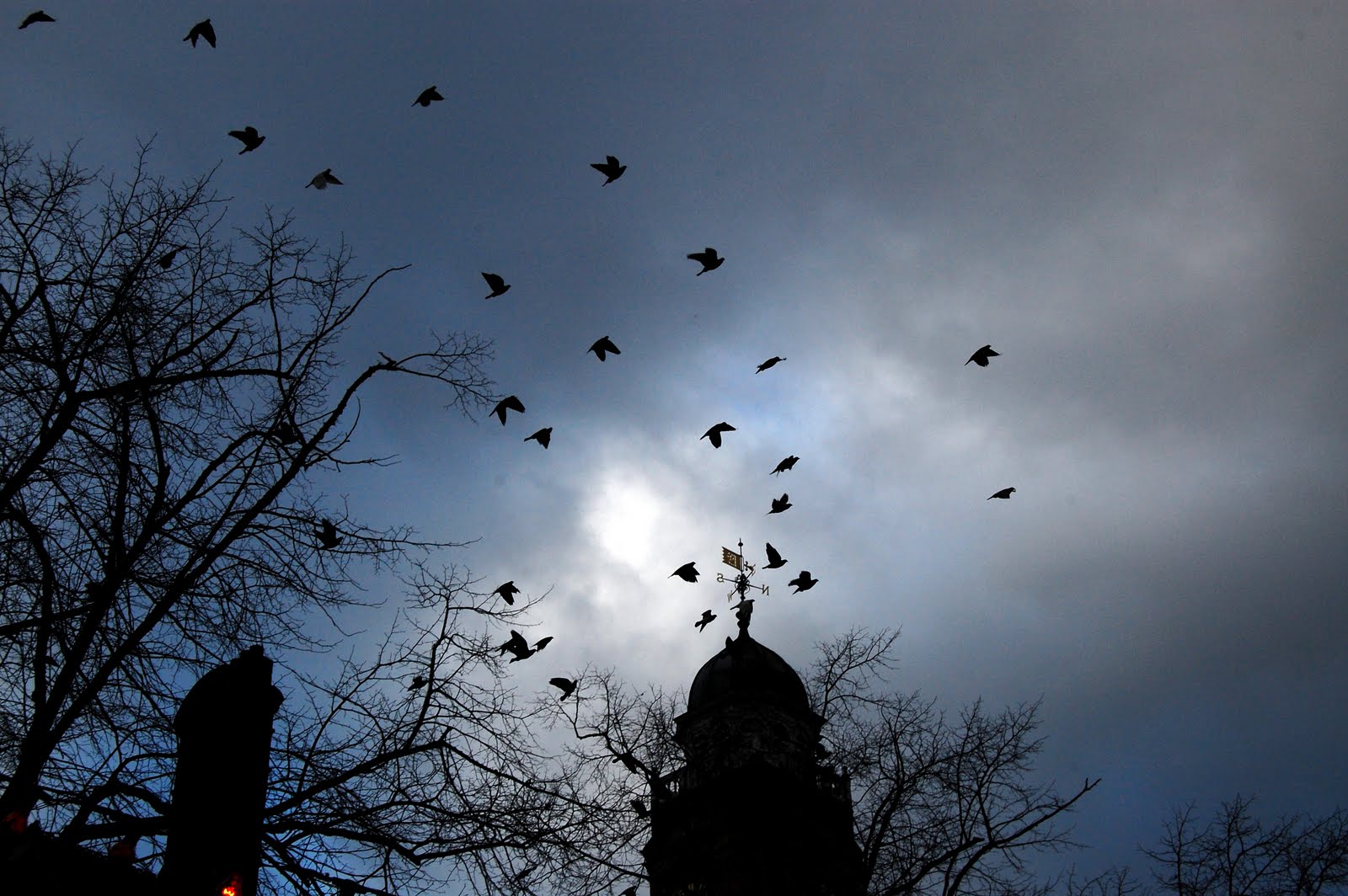
For this i did wonder what on earth i could do for imagery, until i found the perfect spot for shooting. In town the old town hall has a weathervain that has the N,S,E,W and is always surrounded by birds. Here i decided to lay in wait until the birds either formed around the vain (sat around it) or flew around it with some great results.


While the first image is still slightly blurred, these were the best out of the selection. i did want a pairing of images to be able to create a good look over a double spread. But after reviewal ive decided that the bottom two are my fave. The middle image because of the encorperation of the weather vane, the sihouetted birds and buildings against the unsual sky, while the second image is just a close up of the birds all in freeze framed. This allows me to try out one of the techniques that i looked at in the books that i looked at, Jim Dines book, where the text is layered ontop of the image, the blank space in the middle allowing the text to sit nicely.
As for the text, i was thinking of simply,
NORTH
EAST
SOUTH
WEST
pulling the audiences eye to the weather vain on the other image and the link to the birds.
black cats
ladders
mirrors (check)
and then i thought, what is the most superstitious thing?
to me i would have to say birds. With hundreds of superstitions about the actitivies of birds i did wonder what exactly had possessed me not to think about this earlier. From a murder of crows and what the number means, to the sighting of a robin before winter, there is literally hundreds of different superstitons out there.
For example:
http://hubpages.com/hub/birds-myths-superstitions-about-birds
I wanted to use one of the less obvious then counting crows or magpies.
Looking into it, supposidly the determination of what way that birds calling determins what is going to happen, the saying goes:
A bird call from the north means tragedy; from the south is good for crops; from the west is good luck; from the east, good love.
For this i did wonder what on earth i could do for imagery, until i found the perfect spot for shooting. In town the old town hall has a weathervain that has the N,S,E,W and is always surrounded by birds. Here i decided to lay in wait until the birds either formed around the vain (sat around it) or flew around it with some great results.


While the first image is still slightly blurred, these were the best out of the selection. i did want a pairing of images to be able to create a good look over a double spread. But after reviewal ive decided that the bottom two are my fave. The middle image because of the encorperation of the weather vane, the sihouetted birds and buildings against the unsual sky, while the second image is just a close up of the birds all in freeze framed. This allows me to try out one of the techniques that i looked at in the books that i looked at, Jim Dines book, where the text is layered ontop of the image, the blank space in the middle allowing the text to sit nicely.
As for the text, i was thinking of simply,
NORTH
EAST
SOUTH
WEST
pulling the audiences eye to the weather vain on the other image and the link to the birds.
More old wives tales and superstitions.
I've actually been trying to focus and find more usual superstitions to add to my book and how they would work in my book. While playing around with the few ideas i started to think about more specific superstitions, from different countrys, different times of year, different kinds of people who would be supersitious Which did lead me to my next idea.
Thinking about specific times of year i thought back to the idea of christmas and christmas decorations. I know that one of the superstions that my mum always trys to live by is this idea that ur decorations must go up 12 days before and 12days after. It then lead me to remember about a series of images that i had taken earlier on in the year, only a few months back where i was shocked to still see lights up. I dont want to do the obvious image of a christmas tree with lights and be so typical, after all this is not a christmas card! but i do remember some of these images and that i liked them because they were unsual, and in a sence they did take me to this idea of a deadly christmas or a not so merry christmas.
When we think of christmas we think of plump green trees covered in lights and surrounded by gifts, while the images that i took were of skeleton like trees and a dull sky. The contrast of the lights to the trees/ and sky is what i liked, the bright prime colours incontrast to an image that would be black and white otherwise. They also dont look very christmasy, and i think one of these images cropped down along side the simple words 12 days would work great as an addition to my superstitions.


Tuesday, 12 April 2011
more superstitions to include?
ive been trying to find new superstitions to include in my book but withtout being to obvious. Looking for some that are supsertitions but can be representented in not such an obvious way. some more of the other superstitions that ive found that i could include are:
one of the many bird rhymes
ivy on a house stops curses and evil
putting out a candle- should not be blown.
dropping a knife means a male caller, dropping a fawk means a woman caller.
looking into some of the 'martime superstitions'
superstitions from other cultures?
revisiting the idea of an umbrella inside?
Saturday, 9 April 2011
Construction of book.
Currently ive been focusing on the contruction of my book, and working on the use of text with imagery. Some of the layouts are working better then others, and have slightly had to edit around images and structures to fit better in with the book. It also makes me think have i got enough superstitions in total? maybe lowering the amount of images per susperstition and such.
so far my structure is as follows:
step on a crack,
number 13,
he loves me, he loves me not,
break a mirror 7 years bad luck
one door open another closes (new year)
Shoes on a table.
Maybe i should look into doing some more superstitions, but as it stands my book is around 40pages long.
The combination of text and imagery seems to work very well. The different ways of combining the two follows this idea of each mircro project having its own indivudal style.
 The inital front cover is to be just plain black, with the name, subtitle and name on the front, and the back my current logo. The reason for the simple black cover is a reminder of the books that u can get with the idea of the 'little book of chocolate, or little book of happiness' style books.
little book examples
 the mock up of the step on the crack, break mothers back images.

Mock up of the text to accompany the door images.
some of the dyptic images such as the he loves me, he loves me not i did experiment with the idea of putting one dyptic on each page. such as below:
 However it didnt really work structually compaired to dyptic spread over a double page. with the addition of text it works alot better.

So what i need to think about now is how many more i would want to include?
so far my structure is as follows:
step on a crack,
number 13,
he loves me, he loves me not,
break a mirror 7 years bad luck
one door open another closes (new year)
Shoes on a table.
Maybe i should look into doing some more superstitions, but as it stands my book is around 40pages long.
The combination of text and imagery seems to work very well. The different ways of combining the two follows this idea of each mircro project having its own indivudal style.

little book examples


Mock up of the text to accompany the door images.
some of the dyptic images such as the he loves me, he loves me not i did experiment with the idea of putting one dyptic on each page. such as below:


So what i need to think about now is how many more i would want to include?
Friday, 8 April 2011
book research- Lewis Baltz
Lewis Baltz's candlestick point is another interesting book that i have found while looking at different books. His work has been described as topography of the emptiness of random, damaged, remote places. The images are very baron and dipict many a landscape.
once again i find myself drawn to a book with such a simplistic cover. Maybe this is because i find myself thinking about a blank cover as so many indivdual themes in one book, it would be more effective to have a simple cover rather then one image that doesnt seem to get the feel of the whole book?
 Once again i also see a more unsual style and use of text. Here it reminds me of such as the text i want to use with my dyptics for he loves me/he loves me not (french for pain and happiness) and how i would want that presented with two singular words spread over a double page like the text below.
 While most of the following layout is straight forwardly the basic two page dyptic with white spaced boarders around the edges one of the things that made me want to write about this book was its mix of black and white imagery with the use of colour. while they are not paired together, most of the images in books will stick to one or the other and not devided between the two types of images. With my book i do have a selection of images that are black and white, which i feel is somewhat out of place, however looking at the combination of black and white accompanied by the odd colour image as seen here im rather impressed by how well it works.


once again i find myself drawn to a book with such a simplistic cover. Maybe this is because i find myself thinking about a blank cover as so many indivdual themes in one book, it would be more effective to have a simple cover rather then one image that doesnt seem to get the feel of the whole book?


Book research- Susan Paulsen
Susan Paulsens book 'Sarah Rhymes with Clara' is a documentry collection of everyday occurences that is around her daily life. This odd little book is a collection of mish mashed images including nudes which works more as a social documenty on her life and those around her.
Once again this book carrys the same simple and plain front cover that may convince the audience that it is not a photography book. However within the pages it soon becomes clear.
 The most prominant thing about the style of this book is its use of white space. The impact that an image has whe accompanied by nothing but white space is actually amazing. While i know most of my superstitions are in focus with this idea of text, it does go to show that white space and the audiences mind can be just as powerful.
 I also like the use of white space even on the pages with writing. here the text is not all alligned the same, and the two images have been shrunk to a much smaller size as if to create more space for blankness. it really is powerful in a sence. Of course she does use a double page for dyptic style images in which she does try and make a colour or visual connection between the two.

Once again this book carrys the same simple and plain front cover that may convince the audience that it is not a photography book. However within the pages it soon becomes clear.


Final selection of images and use of text:
Step on a crack images:


Unlucky umber 13


he loves me he loves me not.


going out with wet hair, catch a cold.

with the addition of the text which consists of the latin name for the common cold.
Break a mirror 7 years bad luck


New shoes on the table: bad luck


New years eve superstition

Subscribe to:
Posts (Atom)