Monday 28 February 2011

broken mirrors- Edits and pairings,

After alot of faffing about with photoshop, cropping down and adjusting the contrast, brightness and vibrancy of the images taken before, i finally achieved a look i was happy with. They do have the colour and similicty that reminds me of warhol's pop art movement. The colours are stand out and work perfectly against the adjusted brightness causing the skin to appear white.  the framing too is important and i think these images suit having the square frame, which in turn could allow me to go full page with these images without loosing anything.

The next step was to find 'mirror' images that would corrispond well with these images. Out of the mirror images i have so far, the selection for the lips image was not so difficult, as it entailed finding the image of the red heart mirror with the best focus and reflection. The match for the eye makeup was abit  more tricky but i soon settled on one that had a good focus and reflection. Again with these images i applied the same edits that i did these image in photoshop, adjusting the brightness slightly and the vibrancy on the colours. For the black hearted image i also adjusted the colour balence to slightly more cyan, so that the colourisation of the image was slightly more bias towards the blue, matching in with the paired image of the blue eyemakeup. The change is subtle, but when the two images are placed next to each other it should be noticible enough to make the association between the two.


On there own they still dont look like much, but put together with their pairings and they actually are rather effective and pleasing to the eye. the simplicity andbeauty is something that i hope to show progressively through the book. Looking and how well these came out, using the process (with out all the shit images and progression between) i think if i collect a different mirror and shoot a few more similar but vaired images that i will be able to collect a good selection of images for this 'superstition', but must remember to keep on the theme of vanity as well as rmemebering colour association and such that seems to work so well in these images.

breaking mirrors more photos- makeup?

So following my 'brainwave' last night about instead of focusing on gettin a perfect visual in shot, by pairing up images. My first instinct was to look back over what people said to me they associated with the idea of vanity. the main object next to a mirror was 'makeup' or a form of makeup.  While many of the images that i got i was not overly happy with, and yet some of them worked better then others


. I wanted the images to be close up, focusing on just one area of the face, with the obvious over the top makeup. However when i got into it, the focus point soon become to try and step back away from the obvious image of just an eye covered in makeup, and more towards this idea of vanity and to some extent distortion caused by the cracks in the mirror but also as a reflection on the idea that whether someone is overly vain or lacking in confidence most people have some sort of body issues. in the end the out of focus images become more interesting then those that are in focus. which was just causes by manually causing it to be the most 'out of focus' as this lens would let me at the focal length it was at.


Infact, just by adjusting the brightness and the vibrancy slightly, like the second image above, the images take on a very simple, and yet dramatic stance. They appear more poparty and very much more abstract. and by selecting the right image, and maybe even taking the idea that i had before about cropping to a more squared shape, i could achieve images that i am more happy with.

'13' page reshoot

as stated before my idea had migrated to making a point of the 13th page in the book, and this idea of photographing the 12th and 14th pages to suggest that the 13th page is missing.
I did like the images i took before of the books and pages, diarys ect. so i thought about that and worked on getting images in the same style but of 12 and 14.
One of my friends made a point of saying it would be good if i could suggest a friday the 13th rather then just any no. 13 on say a calender, so i took this into concideration while shooting the images for this superstition,
Obviously while before was experimentation this is far more focused on what i wanted from the imagery. My original selections were:


However when put next to each other the angles of the books make the images look weird together. Either i needed on in a similar angle or a completely different angle of shot really. So experimenting with the other images i took i found the image below had almost the exact same angle of the book which fitter much better with the other image.
The only thing that annoys me wit this image is the fact that u can still see the number 13. which obviously was not the point of this expercise. after much debate over what would be the best way to get rid of this -reshooting but that would mean gettin angles right and trying to crop out the 13, editing it out, or just leaving it. I tried experimenting with editing out the numbers and it seemed like the best way around this plight.  It also makes the 14 jump out of the page alot more. which i like.

Patrick Mccoy- Black Cabs.

Patrick Mccoys black cabs are a perfect example of repetition in images. He took a serious of images on a static camera in the back of a black cab, at different intervals during the journey, with different passengers. Its shows the passing of time, and the repetitious background and sometimes even passengers make the audience compair the differences between each of the images.  I saw this and compaired it to my work on the Step on a crack, break your mothers back images. I like how each one is different, but still linked.


Sunday 27 February 2011

breaking mirrors more photos


Once again i was experimenting with trying to be able to capture a good reflection in the mirrors, this time after applying some 'over the top' makeup to myself to try and get over this idea of vanity and the perception of what is beautiful and how others have esteme problems. I am still finding it very difficult to capture a good selection of reflection in the images. So debating how to get around this, maybe if i could pair up a straight forward image of a mirror to a corrisponding image of something that could be seen as vanity or have some links to some of the 'objects' that remind people of vanity, as i found from my reserch.  to test this theory i will take images and match them to what i think would be images that work from this selection. 
I Also feel like some of these images would better suit being tightly cropped, and as i am looking at a square book maybe experimenting with a square crop on these images? 

Thursday 24 February 2011

number '13' developments

While i like the idea of focusing on the '12' and '14's i think it still needs another part of connection. Which is why ive decided to look back at the idea of photographing book pages, as im going to locate these images on/around the 13th page of the book. this means that when working out the layout of my book i must take into consideration this.  Maybe if i photograph images of 'pages 12 and 14' and them put them on a double page spread before the 13th page? i think once ive started to look at the layout of my book that i should experiement abit with different placement for this superstition.

Wednesday 23 February 2011

'13' photos. inital ideas and images.

One of the other superstitions i wanted to look at was the idea that the number 13 is unlucky.  It is one of the most well known and still currently viewed superstitions. My inital photos for this idea was a documentry style of photographing everything i could find with the number 13 on, books, doors, letters, times. Some of the images came out alright i guess, there not overly interesting and very obvious. I do like the use of the depth of feild on the number, which was easy to achieve as most of the numbers are pretty small print. While looking at the images i was thinking that images like this would make a good grid, and would maybe work better cropped squared, so below ive tried some of the better images cropped to a square. 


While i liked the cropping of the images, they are all very similar and i need to get out and find more interesting things with the number 13 on them, however i am thinking maybe it is being to obvious with the superstition, one of the things that ive always been sure of is that i didnt wanna be obvious with the imagery that i use and maybe this is? Maybe i could look into creating dyptics from the number '12 and 14' and make it look like the number 13 has been removed, which in some places they still do, refusing to have 13th floors, or number 13 on a road? It gives me something else to think about . 
 

Break Mirror starting point?

So from looking at the responces from my questions about vanity (what words/objects best suggest vanity) most of the responces are mirrors (which is good because it backs up my idea to look at vanity in this) as well as references to plastic sergury and makeup, as well as specific products. so initially i wanted to see how or if i could create creative images around the idea of the products that we use to change our images and make us different. I really need to take a step back again


While some of these images came out pretty well, they really are not up to the creative standard of the rest of the images in the different superstitions. The images just dont have the connection or feeling that the others do.  They almost feel like an advertising shots rather then images making a statment. 


Tuesday 22 February 2011

Breaking mirrors- more inital photos

Here, i just wanted to experiement using a ditigal SLR rather then my phone, as the phone had a fixed focal length i wanted to see how easy it would be to capture the images in the glass/mirror while trying to focus the camera manually. its not as easy as it looks!  So i really need to start thinking about what i want to do with these images and where to go from here with the whole idea of vanity,

Also to help ideas flowing, Ive asked people i know two questions:
name 3 objects that remind u for vanity, and what 3 words would best describe vanity. The responces of which i will put in my note book.


Monday 21 February 2011

breaking mirrors- Initial photos


My inital photographs didnt exactly come out to be ... inspired? They are pretty basic shot of the borken mirrors, taken even more badly on my ipod. i originally thought that using my phone worked so well with the step/crack images that it would be ideal to use it for other superstitions, but i have to admit, it didnt work out very well. I think the reason using my phone works so well with my stepcrack images is that it has a purpose, by allowing me to take images without influencing the people walking past. Here it really is just lazyness. which i really dont like, but it does give u a look at what the mirrors look like i guess? The one thing i did notice is that its pretty difficult to get an image how u want it reflecting off the mirror. This is gonna be more complicated because i actually like the looks of the broken reflection, its symbolic as well as adding a great distortion to the images, which i think is going to be a great look. 


Sunday 20 February 2011

Break Mirror inital ideas.

So far ive been pretty focused within my two initial ideas and i thought i better breaking into more superstitions before it gets to late and i dont have enough time to develop them to the stages of my other superstitions.
The next one i have decided to look into is the superstition of breaking a mirror causes 7 years bad luck. The interesting thing about this one is that when i said to my mate that i was going to do this superstition her reply was 'you cant do that!' which was an interesting responce. This is still one of the most common superstions believed.
My initial ideas were to get my hand on a mass of old, cheap mirrors and break them placing them into different locations, however as my other superstitions have abit of a deeper meaning then just a pretty picture, i thought that maybe i should look abit deeper into the subject. 

Thinking of what would go well with mirrors the first thing that came to me was vanity.  mirrors is often associated with people who are vain. It lead me to the association between the two, as well as the first mirrors i brought were actually heart shaped, suggesting that the person who is looking at themselves are looking at themselves in a heart with is pretty ego-tastic.

the only problem how was i to capture vanity? time for a few photographic exeperiements. 

Wednesday 9 February 2011

Text experimentations- Step on a crack break your mothers back

Obviously the first place to start would be the application of the actual supersition either under the grid images or on the page next to the image, such as the image on the right hand page and the text on the left. However i dont want to be obvious with the text, i dont want to state the exact superstition i want the words to play with the images to create the superstition. I could play with the idea of repetition with a single word repeated over and over underneith each photograph. But the idea would be what word would be repeated? Or maybe i could make use of the idea of a book and have the corrispoding text on the opposite side, like stated before, but being more playful with the use of text. Below are a few mock ups that i have created to give the impression of the look i could achieve with different techniques and maybe even different ideas of what to play with with the text and how it corrisponds with the images. 

Firstly i did mock up what it would look like in the book with the basic 3x3 grid and the incorperation of the superstition itself. While i am unsure of what size grids im going to do for my final piece, i do like the look of the 3x3 grid and as they do say things are more astetically pleasing in groups of odd numbers, so it would be between 3x3 or 5x5. The text looks great with the choice of a simple black font but i am sure now that the obvious writing of the superstition of itself is not what i want to include in this book. As my main influence is Sophie Calle's book exsquite pain, looking back, none of the words are that obvious what they are in relation too, except for the peice of text at the start of the book to which explains the project, or the project statement in the book. What i need to think about next is what i could put in place of the basic text that ive used here?

Here, i used the basicly same format as the image above, a simple contrasting text, the only difference is the quotation n text used. Here i just made up a saying about everything being in walking distance, while i am normally rather good at coming up with random little sayings that would be perfect for encorperating maybe with other superstitions, here i just drew a blank without being obvious to the images or the superstition itself. Maybe this is a look i could encorperate into a later or alternative superstion. Alternatively i could look at using famous quotations that may fit, which would relate to my very original idea of using the writings of Edgar Allen poe in my work?

This layout, of using text in the imagery grid itself, is another way of encorperating text with the images, both with its good points and its bad. What i do like about the image as the use of text itself. the idea of using the 'step' repetitavly, and the way it allows me to point out the ideal that someone is stepping on a crack on the ground which adds a link back to the original superstition which i love. The downside to this is that i feel it makes the image look messy. It distracts the audience eye away from the images themselves and takes them to the text and the gaps inbetween the images.  It also doesnt look right with the breaks and the images without anyone in them.
This layout almost seems like a hybrid of the two layout/text ideas ive had so far, and actually it is my fave BY FAR. it allows for the text to be kept separate from the images while still allowing the connection to be made between the two. The mass repetition of the word 'Step' reinforces the use of the grid and maximises the feel of the size and imact that i was trying to portray to not only suggest at what a big influence superstitions used to be but also to show the easiness of stepping on cracks in modern society when the ground is pretty deshevelled. I like the change in the last word which brings a new dimention and would draw the audiences eye to the flooring and the exchange between the images where people are stepping on the cracks and those at which arnt (the empty images.) Also it is very structured and well constructed to the size of the corisponding grid to allow the square boundries of the images to be mirrored in the text formatting. The only query i would have would be that if i wanted to encorperate more then one grid, i would not want to use this on every double page. However i could use one 'square' of text at the start, and one at the ending of the selection of grids, but im sure the logistics could be worked out once the structure of my book is taking strenghth.  

while i know most of these images focus on people stepping on the crack between two bricks, or slabs. however i think the structure of these images fit better with the more highend market idea then that which has a more grimey feel such as those with the broken and disheveled pavement.

Tuesday 8 February 2011

Book design and creation

While explording different places and websites that create books and thinking of the best design (see notebook) Ive chosen to use www.blurb.com/Uk to produce my book because it allows me the most free range with my creation of my books, with more sizing and binding then offered by any of the other websites/companys ive looked at. I also watched reviews by customers already brought from the company and im very impressed. I also have chosen to create a square book, in fitting with the use of grids, and both portrait and landscape images. Overall i think i could be able to create a book up to the standard that i want to create.
Using Blurb i have the option of two sizes, the regular 7 x7 square book or the large at 12 x12 inches. Looking at the relative sizes i think i will opt for the 12 x 12 book to get the most of my images. Ive also desided that the pages are to be plain white, with no page numbers except for the 13th page to encorperate the superstition that the number 13 is unlucky. 

What i need to think about next would be a name, as well as any information that i would like inside, an introduction to the project?

Monday 7 February 2011

Use of text with images and design of book- initial ideas.

As i said before i wanted to encorperate text with my images to change the meaning of the images, to add or to effect the audiences view on the images and cause a link between the less obvious images and the actually superstitions themselves. I really need to think of the text i would want to go together with the images.
the superstitons ive been focusing on so far are:

Step on a crack, break your mothers back.
He loves me, he loves me not.


I think the use of text is very important with these images. The initial reserch and idea for this project was looking at the relationship between text and imagery.

I also will need to start to concider the design of my book that i which to produce. A name, cover, spinal details? I think that i will start to make notes in my note book for the design of the book while i manage to continue into getting more superstitions and oldwives tales.I need to also work out how many images of each superstition i would need to include in these images. 


I may run a trip to the libary to look at different photography book styles or maybe even a bookshop, to get some ideas for layouts.


Sunday 6 February 2011

More love/not dyptics -Similar imagery vs difference in images?

Here are some of the dyptics taken from my second selection of winter images.These images ive tried to keep to the idea of similar images, framing, depth of feild, as well as a few images that ive tried not to be to obvious with the link between imagery. Obviously i want them to be contrasting, to get the full effect of the summer winter contrast. It really is about trying to get the correct balence between being similar, and being directly the same.

Here, the images are very similar in some ways, the branches semm to follow from one image to the other. The depth of feild is pretty much the same between the two images, while the angle of the branch on the left is different to that on the right. The main contrast between the images is the vast colour changes. the greens and yellows in the left image are very vibrant in contrast to the pale, dull colours of the winter image. even the buds are just white and grey. While they are very good picked specifically together, I dont really feel as confident with this image in comparison to some of the more stronger images that i have from this idea. 


Here the image taken in the summer, i had converted using photoshop to this tilt-shift effect, so while looking at the winter images and i spotted this image and its similartitys to the other image, i wanted to see how the tilt shift effect would look on the photos. 
I rather like the way in which this image is similar but not as identical as the dyptic that is above. While the tilt shift blur isnt exactly the same length, distance ect but the effect works well at allowing me to select the area that would look good for the individual photograph. Here the images are similar, but different too. the images both show paths winding threw the grass with the trees branching over the pathways. This image is one i really like, it is both similar and yet different and contrasting. 


This image again is rather similar in looks. Im really not overly sure about these images. The winter image is actually somewhat brighter then the summer images. The green is vibrant and yet it darkens the image alot, while that of the winter is bright, light and the hints of green and yellow are not dull and darkened like the images in the other dyptics.  I dont really like these images in comparison to the others. 


This images i was unsure about pairing together, however in the long run i think it is very appropriate.  Each image has a branch reaching across the frame. The colouring is more back to the paletes associated with the equivilent season.  I like in these images the mixture of textures from the soft edges and almost flowing curves of the leaves in the summer plants, while the harshness of the torny bushes are symoblic of the harshness of the winters. It almost shows the contrast in nature: the rebirth and the destruction, The sun is clearly out in the summer images while the winter the thorns are so dence that the background is blacked out.


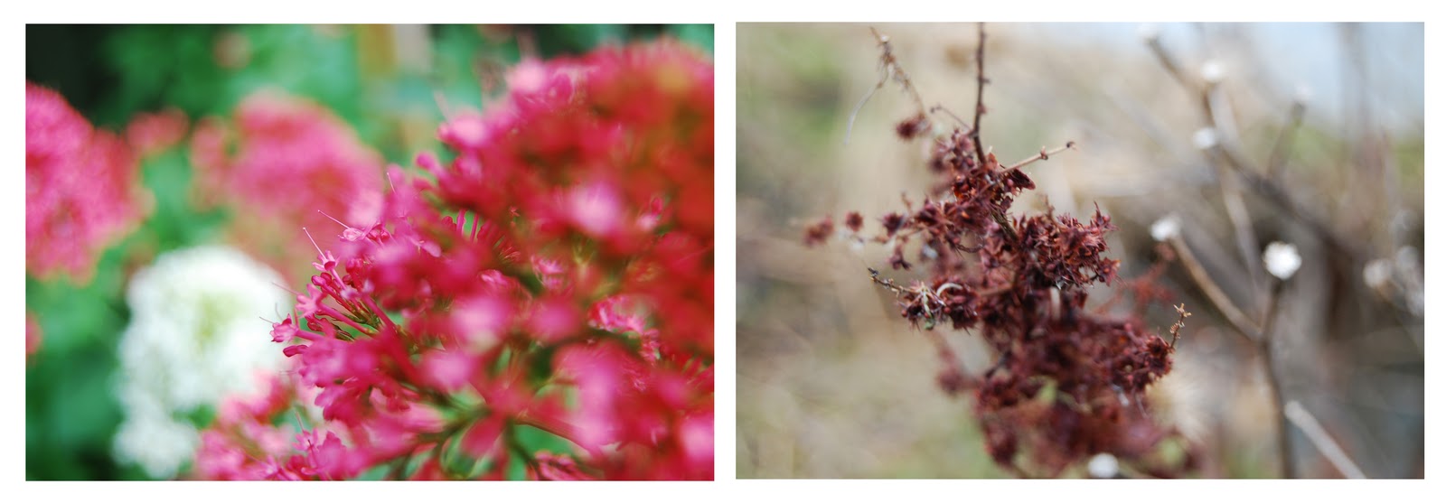
Once again Here the images are abit more varied in framing and style but they seem to work very well together. the colours almost match as one being in summer, bright vibrent, colourfilled, while the contrasting image looks as if the same colour is dead. the depth of field is very similar between the two, and while the left image is very round, curved in the shaping, the right is very straight, pointy. I do really like this image mix and think it achieves the correct look of what im going for. This is one that i would concider including in my final selection.

I think the best thing for me to do is to create images that are similar in some ways and yet still remain sepourate. The images i like more seem to be ones that have obvious similaritys and yet some very obvious differences.

Saturday 5 February 2011

love/not photo winter images 2

My second winter photoshoot, had a similar effect as the other images. I tried to get the subject different with different framing and experimenting with angles. Again the colours are from a dark and duller toned palate, the weather is overcast. I also selected some different images to experiement abit with the idea of the different images, as well as still focusing on the images that are the same but summer/winter.