Monday, 7 February 2011

Use of text with images and design of book- initial ideas.

As i said before i wanted to encorperate text with my images to change the meaning of the images, to add or to effect the audiences view on the images and cause a link between the less obvious images and the actually superstitions themselves. I really need to think of the text i would want to go together with the images.
the superstitons ive been focusing on so far are:

Step on a crack, break your mothers back.
He loves me, he loves me not.


I think the use of text is very important with these images. The initial reserch and idea for this project was looking at the relationship between text and imagery.

I also will need to start to concider the design of my book that i which to produce. A name, cover, spinal details? I think that i will start to make notes in my note book for the design of the book while i manage to continue into getting more superstitions and oldwives tales.I need to also work out how many images of each superstition i would need to include in these images. 


I may run a trip to the libary to look at different photography book styles or maybe even a bookshop, to get some ideas for layouts.


Sunday, 6 February 2011

More love/not dyptics -Similar imagery vs difference in images?

Here are some of the dyptics taken from my second selection of winter images.These images ive tried to keep to the idea of similar images, framing, depth of feild, as well as a few images that ive tried not to be to obvious with the link between imagery. Obviously i want them to be contrasting, to get the full effect of the summer winter contrast. It really is about trying to get the correct balence between being similar, and being directly the same.

Here, the images are very similar in some ways, the branches semm to follow from one image to the other. The depth of feild is pretty much the same between the two images, while the angle of the branch on the left is different to that on the right. The main contrast between the images is the vast colour changes. the greens and yellows in the left image are very vibrant in contrast to the pale, dull colours of the winter image. even the buds are just white and grey. While they are very good picked specifically together, I dont really feel as confident with this image in comparison to some of the more stronger images that i have from this idea. 


Here the image taken in the summer, i had converted using photoshop to this tilt-shift effect, so while looking at the winter images and i spotted this image and its similartitys to the other image, i wanted to see how the tilt shift effect would look on the photos. 
I rather like the way in which this image is similar but not as identical as the dyptic that is above. While the tilt shift blur isnt exactly the same length, distance ect but the effect works well at allowing me to select the area that would look good for the individual photograph. Here the images are similar, but different too. the images both show paths winding threw the grass with the trees branching over the pathways. This image is one i really like, it is both similar and yet different and contrasting. 


This image again is rather similar in looks. Im really not overly sure about these images. The winter image is actually somewhat brighter then the summer images. The green is vibrant and yet it darkens the image alot, while that of the winter is bright, light and the hints of green and yellow are not dull and darkened like the images in the other dyptics.  I dont really like these images in comparison to the others. 


This images i was unsure about pairing together, however in the long run i think it is very appropriate.  Each image has a branch reaching across the frame. The colouring is more back to the paletes associated with the equivilent season.  I like in these images the mixture of textures from the soft edges and almost flowing curves of the leaves in the summer plants, while the harshness of the torny bushes are symoblic of the harshness of the winters. It almost shows the contrast in nature: the rebirth and the destruction, The sun is clearly out in the summer images while the winter the thorns are so dence that the background is blacked out.


Once again Here the images are abit more varied in framing and style but they seem to work very well together. the colours almost match as one being in summer, bright vibrent, colourfilled, while the contrasting image looks as if the same colour is dead. the depth of field is very similar between the two, and while the left image is very round, curved in the shaping, the right is very straight, pointy. I do really like this image mix and think it achieves the correct look of what im going for. This is one that i would concider including in my final selection.

I think the best thing for me to do is to create images that are similar in some ways and yet still remain sepourate. The images i like more seem to be ones that have obvious similaritys and yet some very obvious differences.

Saturday, 5 February 2011

love/not photo winter images 2

My second winter photoshoot, had a similar effect as the other images. I tried to get the subject different with different framing and experimenting with angles. Again the colours are from a dark and duller toned palate, the weather is overcast. I also selected some different images to experiement abit with the idea of the different images, as well as still focusing on the images that are the same but summer/winter. 


Friday, 4 February 2011

Intitial experimentation with diptycs

Here the images chosen reflect each other pretty well, the left, a hidden bathway between the sunkissed bushes. The colours reflective of a warm summers day. The two trees acting almost as a frame for the image and draws the audience to explore the image. The image to the right is obviously very opposed to the summery image on the left. The colour palette is alot darker, alot more nautral and dulled down. The  path deviding the second image is muddy and sepourates the muddy dead grass thats not at all close to the vibrancy of the image to the left. The trees are bare and lifeless


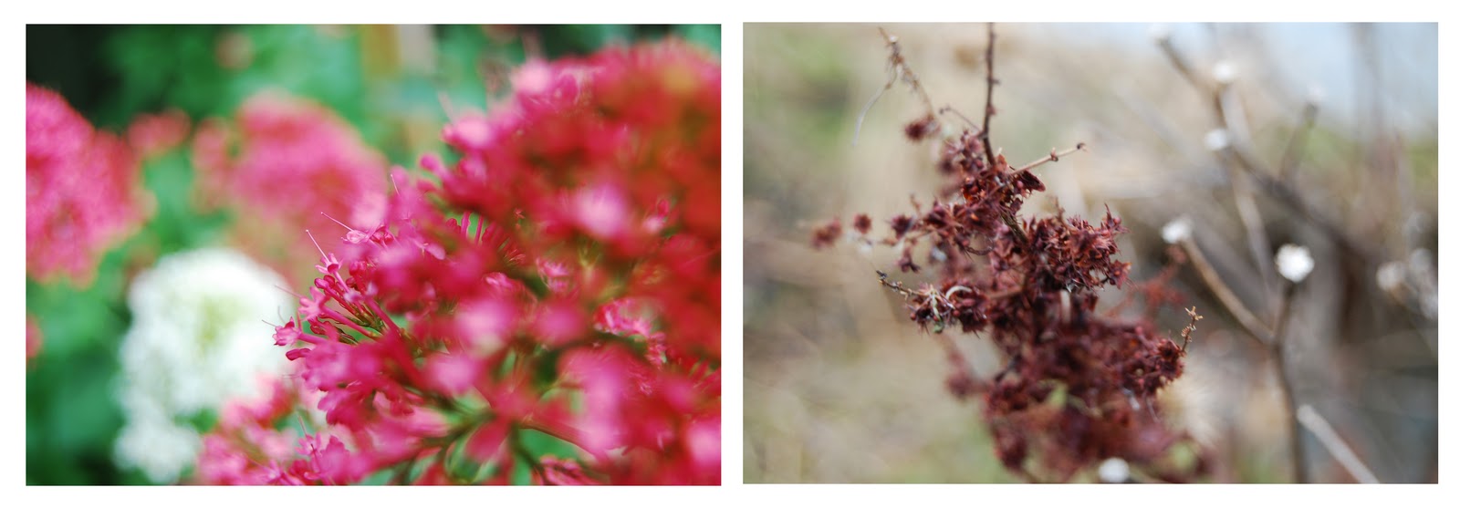
This image also seems to work well together. The depth of feild i kept the same in both images. The one on the left the white jumps out from the green background, the focus very much a mix of in and out, with onle some of the flowers in focus. The image on the right is a different 'flower' more like small pinecones, alot more harsh to look at and a big contrast to the soft small petit flowers of the image on the left. The depth of feild between the images are pretty similar, and the colours of the in focus items contrast each other perfectly, the darkness of the winter images compaired to the bright and freshness of the summery images. why the angles of the flowers are different, i still think these images contrast very well in comparison of both of the images. While the image on the left has a slight blow out to the highlight in comparison to that on the left, i think that little bit of brightness makes the rest of the image appear more dull and adds to the effect.

With these images, i tried to move away from the obviously in your face similar imagery between the two and im unsure if i like this as much as the other images. Here the images are more apposing of each other. One filled with masses of greenery and the central of the image is taken up by the focus of two dadilions. The colours are bright and vibrant which contrasts to that of the winter image which is filled with doom and gloom to some extent, while the depth of feild here is completely different between the images unlike the two dyps above which have been the same between the same images. The image on the left is alot different, with its shallow depth of feild and a completely different structure to the image.
While the images are alot more different to the images above, apart of me still likes the effect that is created by the images being different. Maybe i should experiment using more different images for more of a contrast, or maybe a mix of both styles as i would need more then one version. If im going to continue myself towards the idea of a book basis rather then that of just prints. 

Thursday, 3 February 2011

love/not photo winter images 1

Here are some of the first images ive taken for this project under the winter part of the 'he loves me he loves me not' comparison. The weather was a typical wintery, grey day which was the contrasting weather that i wanted to the summery light images i took earlier on in the year.  I tried to focus and remember some ofthe more prominant images from my summer images, however i found that abit more difficult to take the images as i worried to much about compairing them to earlier images. In the end i decided to stop thinking of the other images and just take images, and to see if there will be a relationship between the images that i took now and those a few months ago and i was actually supprised at home some of the images reflected perfectly with each other. 


Wednesday, 2 February 2011

love/not photo summer images

Here are some of the images that i took over the summer period. These images would be perfect for the 'he loves me' part of the diptycs for the specific superstitions. The only downside with this idea as the summer has passed i cant really take any more 'he loves me images' until the seasons change into spring and the flowers and trees start to grow. 


I like alot of these images due to the bright warm colours, and the light creates a very summery and happy feeling to these images. I think the next priorety for this 'superstition' is to create images that relate and reflect the same style of images, but with a winter, darker, 'more dead' style to the images. I want to create images that have obvious silimaritys structually but remain different in such a way that the contrast is vast.

Tuesday, 1 February 2011

Naoya Hatajeyama

Naoya Hatajeyama uses repetition in alot of his work, creating grids of similar but slightly different images to make a statement about time/space. Also, alot of his images include reflections in water which also creates the effect of repetition within the image as a singular. When added to a grid these images become far more stunning as they appear to form geometric patterns and shapes. they almost take on a quality of the magic pattern books where matrixing of the brain allows new images to be formed.  I do like the use of the reflections in the images but it wouldnt be very appropriate within my 'step on a crack' images. However it maybe more appropriate within one of my other susperstitions that i look at. 
Many of his images look at the change caused by time (images of the same locations repeated and yet the lighting/time causes the images to be different) or space (images taken in the same general area but ranging in movement of the camera or finding repetatitve shapes but not exactly the same. as a whole the images make for an interesting look at how other people use repetition in there images and make use of grids to adds a different twist to the images, and its effect on the audience.