A star is born is a book that i have, it traces how stars on both sides of the camera shape the image of musicians and rock bands. Glamour portraits, journalistic documents of live performances and PR materials from record labels form the core of this publication. I know like most of these books it doesnt have alot to do with what subject matter i am doing but the style and presentation in the books is really what i am looking at more then anything else.
Below we see an example of the use of imagery with the accompanying essays in this book. rather then dotting the images all over the place they just place them in blocks as to keep the pages more tidy. Ive not really thouight about essays or introductions to my book just yet, i really think an introduction may be best to the book as most photography based books have them.
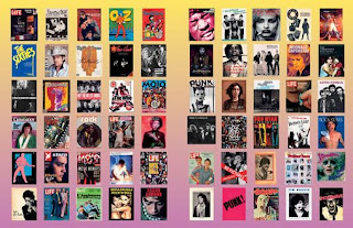
Below we see a good example of a gridded double spread. However the background is really naff with that awful gradient over it, i do like the effect of seeing so many images over 2 pages, and gives that great effect on the idea of repetition as well as giving the scale i wanted on some of my images.
Theses images below are again a different take on the one big, one small image, this time the large image stretched across the two pages while the small image is rather alot smaller just fits nicely in the corner. as stated before i am very weary of a stretched image due to the nature of the books binding and loosing the image or part. This time there is text under both of the
This again is another double page pull across but what interested me about this image was the shape and the sizing, when sizing image i dont think about covering 4/5ths of the page with the image, so far ive been thinking in terms of, all or nothing when it comes to sizing these images. but this has made me re-think my ideas of placement and sizing of my images.


No comments:
Post a Comment